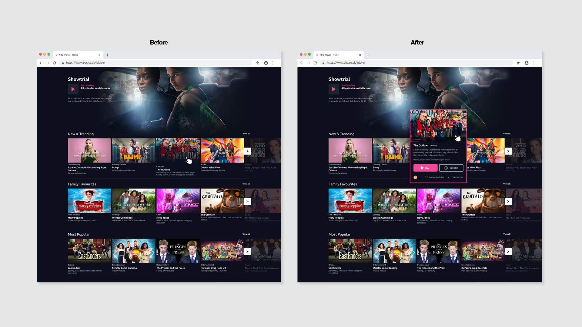
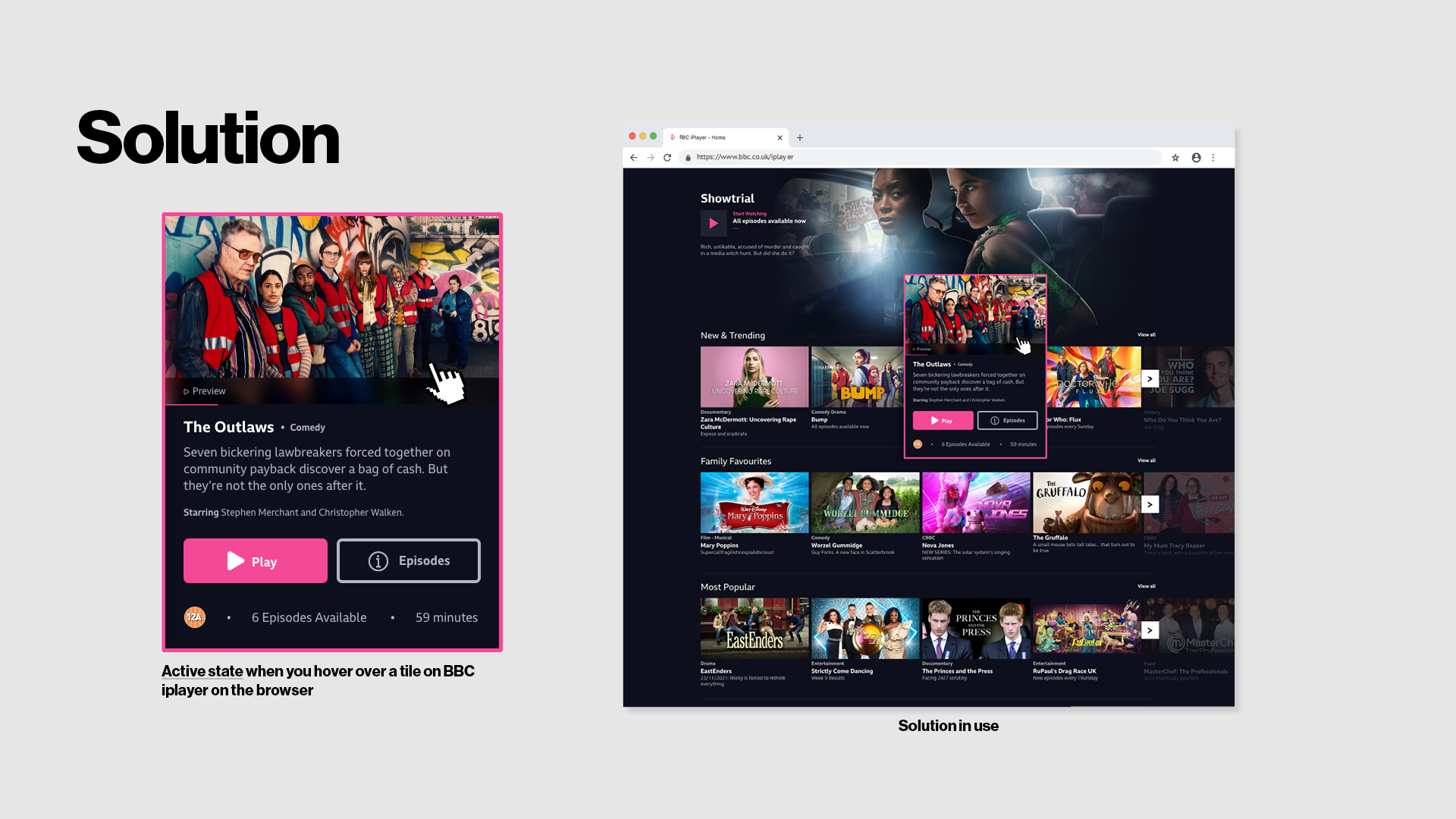
I have an idea to visually solve a feedback loop issue on iPlayer, making sure it is suitable for user needs. Also it opens up an opportunity to streamline the amount of interactions to get to the content that the user wants to view on there computer.
Allow users to know what information they have highlighted with a pop up box that display information in a clear manner that is informal to the user and removes the need for extra clicks.
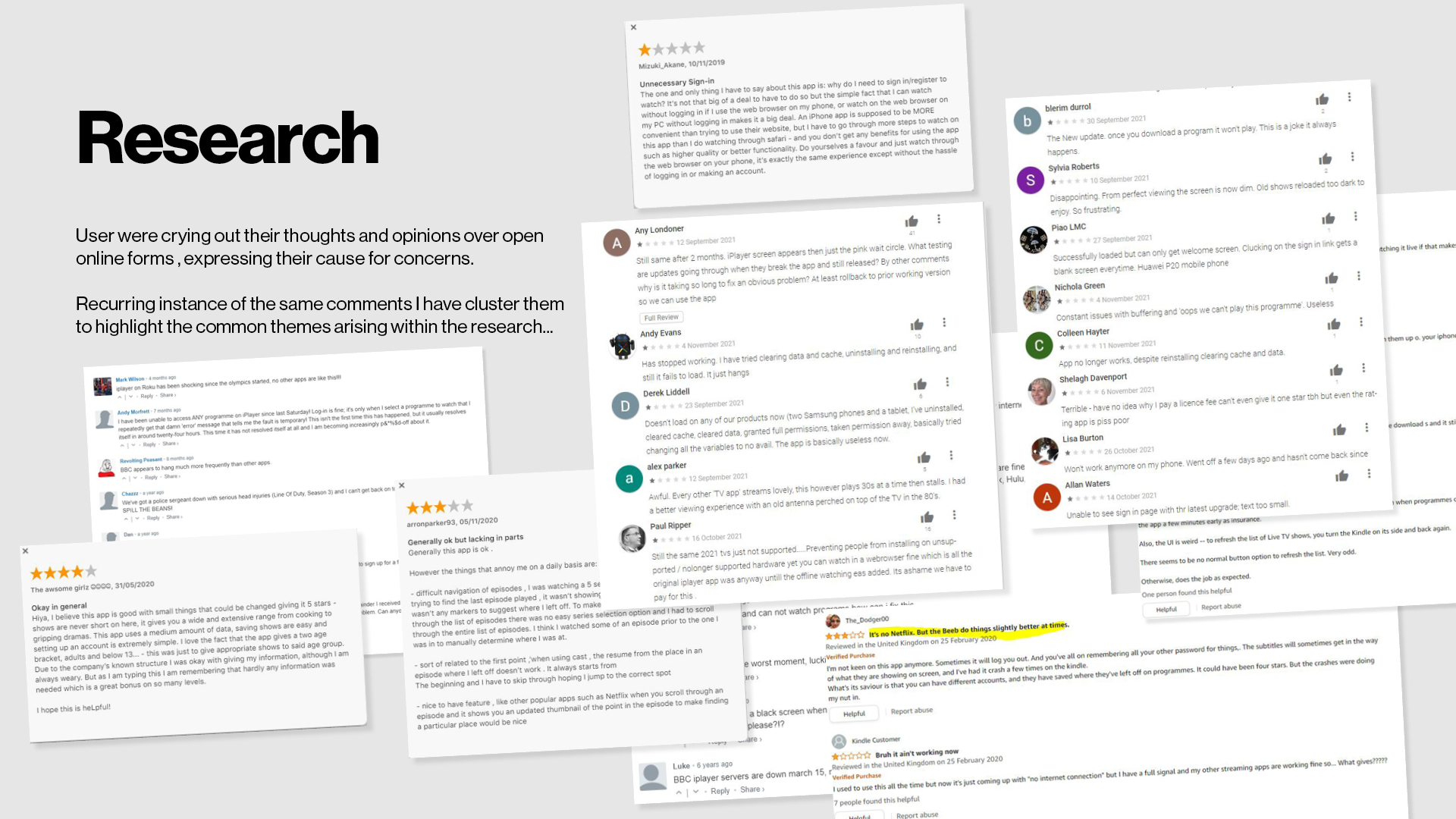
This section takes a deep dive into the understanding of the user. Looking at user research to form a user persona, an empathy map and defining a solution. Users were crying out their thoughts and opinions over open online forms , expressing their cause for concerns. Recurring instance of the same comments I have cluster them to highlight the common themes arising within the research.
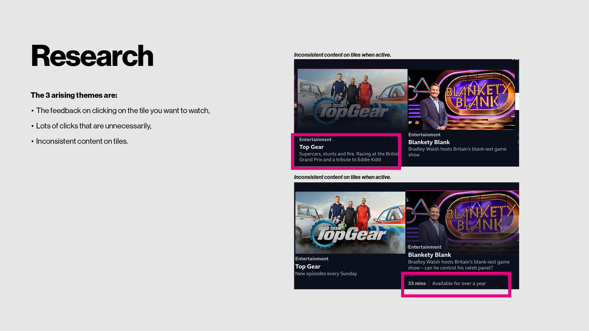
The 3 arising themes are:
- The feedback on clicking on the tile you want to watch,
- Lots of clicks that are unnecessarily,
- Inconsistent content on tiles.
Based on users goals and needs, the outcome should:
Features:
- Display accurate data and information for her media needs,
- Remove barriers from her reaching the content she wants,
- Displaying an active state that is usable without glasses.
Necessities:
- Align user needs to the business,
- Retaining the user so she does not use another media platform to watch the shows.
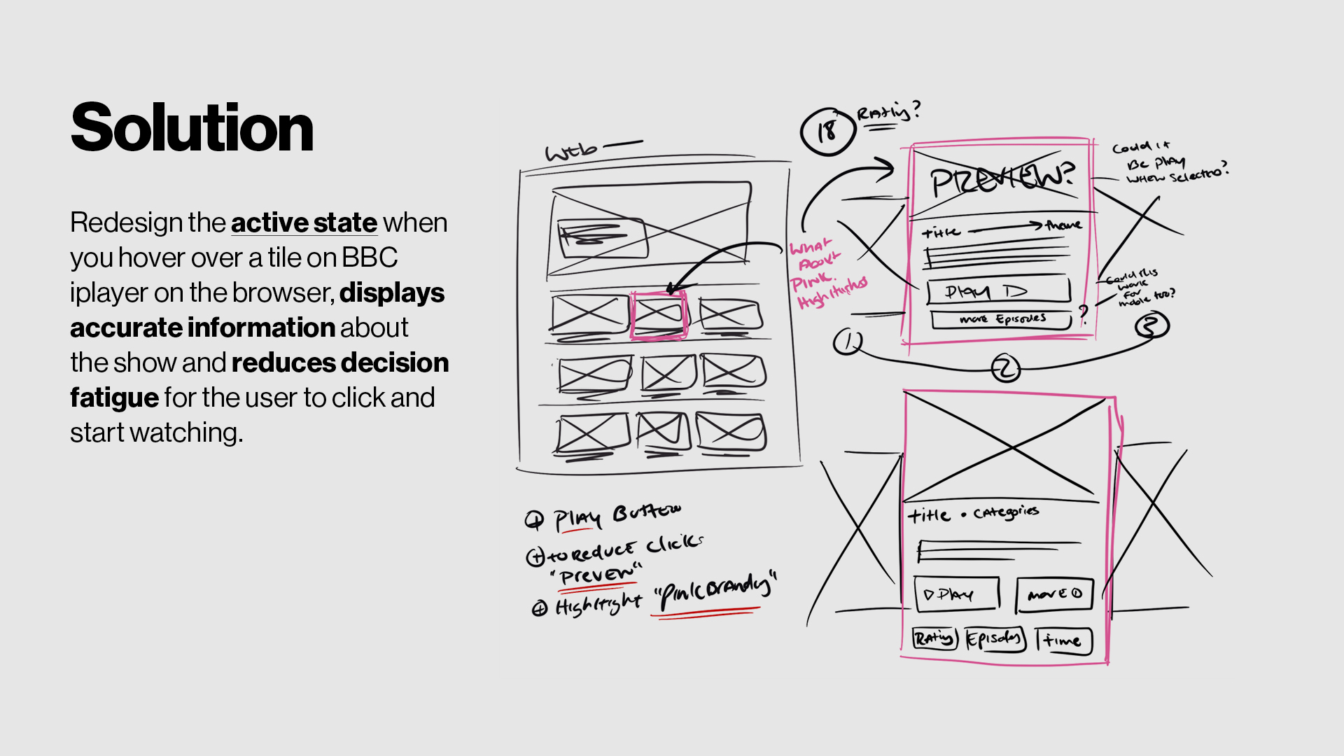
Redesign the active state when you hover over a tile on BBC iplayer on the browser, displays accurate information about the show and reduces decision fatigue for the user to click and start watching.


