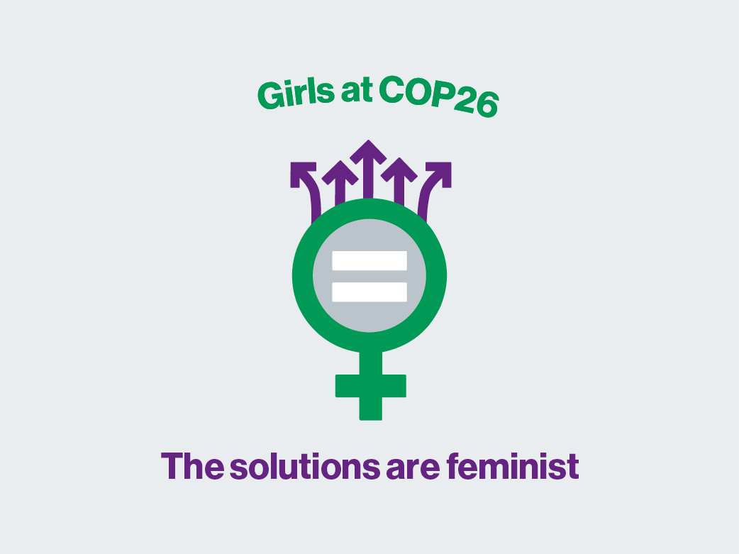
Archive

Girls at COP26_Preview

Girls at COP26

[vc_row][vc_column][qodef_custom_font font_family="Montserrat" font_size="18" line_height="34" font_weight="700" letter_spacing="-0.4" text_align="left" content_custom_font="Girls at COP26: The Solutions Are Feminist" color="#222222"] [vc_empty_space height="16px"][vc_column_text] More than 2500 S3 secondary pupils from schools across the city will gather at a special conference at Glasgow Caledonian University for the duration of the COP26 to debate different aspects of the climate emergency with a female twist. #GirlsAtCOP26 [/vc_column_text][/vc_column][/vc_row] [vc_empty_space height="16px"][vc_row][vc_column][qodef_custom_font font_family="Montserrat" font_size="18" line_height="34" font_weight="700" letter_spacing="-0.4" text_align="left" content_custom_font="The problem" color="#222222"] [vc_empty_space height="16px"][vc_column_text] In anticipation of COP26 in November, the Glasgow City Council faced the urgent need to establish an identity for Girls at COP26. This initiative required a rapid turnaround of identity design within a two-hour timeframe upon receipt of the brief. Swift distribution of assets to printers and ad agencies was essential for seamless integration into their COP26 advertising campaigns. [/vc_column_text][/vc_column]   [qodef_separator class_name="" type="full-width" position="center" color="#E0E2E2" border_style="" width="" thickness="" top_margin="" bottom_margin=""]   [vc_column][qodef_accordion style="boxed_accordion" skin="dark"][qodef_accordion_tab title="What I did" title_tag="h4"][vc_column_text] Collaborated with stakeholders to analyse and interrogate the brief that was...

Continue Reading
The-Village-Storytelling

Village Storytelling Centre

[vc_row][vc_column][qodef_custom_font font_family="Montserrat" font_size="18" line_height="34" font_weight="700" letter_spacing="-0.4" text_align="left" content_custom_font="Village Storytelling Centre - Redrawn Identity" color="#222222"] [vc_empty_space height="16px"][vc_column_text] The village storytelling centre is Scotland’s leading applied storytelling organisation and a centre for contemporary storytelling performance. [/vc_column_text][/vc_column][/vc_row] [vc_empty_space height="16px"][vc_row][vc_column][qodef_custom_font font_family="Montserrat" font_size="18" line_height="34" font_weight="700" letter_spacing="-0.4" text_align="left" content_custom_font="The problem" color="#222222"] [vc_empty_space height="16px"][vc_column_text] The identity that the client was currently using was pixelated and was not suitable to be used within print or online outputs. The charity hosts events regularly which can be online and in-person and is part of a network of sovlers which the identity appears on all the media that is produced. [/vc_column_text][/vc_column]   [qodef_separator class_name="" type="full-width" position="center" color="#E0E2E2" border_style="" width="" thickness="" top_margin="" bottom_margin=""]   [vc_column][qodef_accordion style="boxed_accordion" skin="dark"][qodef_accordion_tab title="What I did" title_tag="h4"][vc_column_text] Met with the client directly to see what the issue was and to plan the milestones, Set out an agreed timeframe on when the work was going to be completed, Redrawn the identify in a vector output from the pixelated JPEG that...

Continue Reading
ROOF Ending Homelessness_preview_tile

Ending Homelessness Campaign

[vc_row][vc_column][qodef_custom_font font_family="Montserrat" font_size="18" line_height="34" font_weight="700" letter_spacing="-0.4" text_align="left" content_custom_font="Ending Homelessness across Europe Campaign" color="#222222"] [vc_empty_space height="16px"][vc_column_text] ROOF is an URBACT Action Planning Network on ending homelessness through housing solutions. [/vc_column_text][/vc_column][/vc_row] [vc_empty_space height="16px"][vc_row][vc_column][qodef_custom_font font_family="Montserrat" font_size="18" line_height="34" font_weight="700" letter_spacing="-0.4" text_align="left" content_custom_font="The problem" color="#222222"] [vc_empty_space height="16px"][vc_column_text] The ROOF Ending Homelessness Campaign needed an identity that could be used across the 9 cities to express their key messages and findings from the 2 year project. [/vc_column_text][/vc_column]   [qodef_separator class_name="" type="full-width" position="center" color="#E0E2E2" border_style="" width="" thickness="" top_margin="" bottom_margin=""]   [vc_column][qodef_accordion style="boxed_accordion" skin="dark"][qodef_accordion_tab title="What I did" title_tag="h4"][vc_column_text] Led the design team and art directed the branding guidelines that was distributed to the 9 cities. All of the marketing within each individual city can be consistent and connect to the final event that was held in May 2022, Designed the concept of the house, with each coloured shard representing one of the 9 partner cities, presented concept to team and stakeholders, Collaborated with the media team to produce the...

Continue Reading
CoLab - Logo

Colab – Innovation Lab

[vc_row][vc_column][qodef_custom_font font_family="Montserrat" font_size="18" line_height="34" font_weight="700" letter_spacing="-0.4" text_align="left" content_custom_font="Colab - Innovation Lab" color="#222222"] [vc_empty_space height="16px"][vc_column_text] The Colab brand suggests the only way to innovate is to collaborate. [/vc_column_text][/vc_column][/vc_row] [vc_empty_space height="16px"][vc_row][vc_column][qodef_custom_font font_family="Montserrat" font_size="18" line_height="34" font_weight="700" letter_spacing="-0.4" text_align="left" content_custom_font="The problem" color="#222222"] [vc_empty_space height="16px"][vc_column_text] The new department needed a new brand identify for its toolkit on collaboration and innovation so, it can be recognisable within the council’s culture. [/vc_column_text][/vc_column]   [qodef_separator class_name="" type="full-width" position="center" color="#E0E2E2" border_style="" width="" thickness="" top_margin="" bottom_margin=""]   [vc_column][qodef_accordion style="boxed_accordion" skin="dark"][qodef_accordion_tab title="What I did" title_tag="h4"][vc_column_text] Worked directly with the department heads to understand their initial ideas, I produce research in the form of mood boards to show the clients the direction that the CoLab brand could be, Produced 4 concepts for the new brand and proceeded with the chosen one above, Designed the simple animation to introduce and elevate this new brand is to make new solutions with people of Glasgow. [/vc_column_text] [/qodef_accordion_tab][qodef_accordion_tab title="The impact" title_tag="h4"][vc_column_text] The charm of the identify and friendless made...

Continue Reading
PopShockPodCast_Preview

Pop Shock Podcast

[vc_row][vc_column][qodef_custom_font font_family="Montserrat" font_size="18" line_height="34" font_weight="700" letter_spacing="-0.4" text_align="left" content_custom_font="The future of pop culture podcasts!" color="#222222"] [vc_empty_space height="16px"][vc_column_text] Do you like Comics, Movies, Video games and everything in-between? Well, This is the podcast for you! [/vc_column_text][/vc_column][/vc_row] [vc_empty_space height="16px"][vc_row][vc_column][qodef_custom_font font_family="Montserrat" font_size="18" line_height="34" font_weight="700" letter_spacing="-0.4" text_align="left" content_custom_font="The problem" color="#222222"] [vc_empty_space height="16px"][vc_column_text] The PopShock podcast needed a brand identify. The social media templates and web banners for all the media outlets that where the podcast is being hosted. [/vc_column_text][/vc_column]   [qodef_separator class_name="" type="full-width" position="center" color="#E0E2E2" border_style="" width="" thickness="" top_margin="" bottom_margin=""]   [vc_column][qodef_accordion style="boxed_accordion" skin="dark"][qodef_accordion_tab title="What I did" title_tag="h4"][vc_column_text] Direct contact with the clients through initial negotiations outlining the scope of the project, Produced research mood boards based on the initial client own inspiration, Presented 4 design concepts for the new identify, Developed chosen concepts and designed the final outputs. [/vc_column_text] [/qodef_accordion_tab][qodef_accordion_tab title="The impact" title_tag="h4"][vc_column_text] Designed an effective identify and engaging with their target audience. The brand is family friendly and easy to share across many forms of medium. [/vc_column_text] [/qodef_accordion_tab][qodef_accordion_tab...

Continue Reading
Silver-Linings

Silver Linings

[vc_row][vc_column][qodef_custom_font font_family="Montserrat" font_size="18" line_height="34" font_weight="700" letter_spacing="-0.4" text_align="left" content_custom_font="Sharing the little rays of sunshine from the pandemic" color="#222222"] [vc_empty_space height="16px"][vc_column_text] The Greater Pollok local community gather 60 stories sharing the good deeds done across the global pandemic. [/vc_column_text][/vc_column][/vc_row] [vc_empty_space height="16px"][vc_row][vc_column][qodef_custom_font font_family="Montserrat" font_size="18" line_height="34" font_weight="700" letter_spacing="-0.4" text_align="left" content_custom_font="The problem" color="#222222"] [vc_empty_space height="16px"][vc_column_text] The client had collected over 60 stories of resilience in the face of adversity and a positive legacy of the pandemic. However they needed it to be designed and produced into a book format so, it could be distributed across the local community. [/vc_column_text][/vc_column]   [qodef_separator class_name="" type="full-width" position="center" color="#E0E2E2" border_style="" width="" thickness="" top_margin="" bottom_margin=""]   [vc_column][qodef_accordion style="boxed_accordion" skin="dark"][qodef_accordion_tab title="What I did" title_tag="h4"][vc_column_text] Led the planning and execution of the project, setting deadlines for the main milestones and for external photographers, Facilitated workshops via Zoom on Miro, assigning for the small design team to follow. Managing the project from concept to delivery with check-ins with the client directly, Set up photo-shoots...

Continue Reading
GlasgowOnline_Preview_tile

Glasgow Online

[vc_row][vc_column][qodef_custom_font font_family="Montserrat" font_size="18" line_height="34" font_weight="700" letter_spacing="-0.4" text_align="left" content_custom_font="Making education accessible for all students and staff." color="#222222"] [vc_empty_space height="16px"][vc_column_text] Redesigning of the education department online platform, making Glasgow’s online education accessible for all students and staff. Creating a centre communications and content hub for Glasgow’s education department. Developing the digital first strategy aligning with the key aims of the GCC. [/vc_column_text][/vc_column][/vc_row] [vc_empty_space height="16px"][vc_row][vc_column][qodef_custom_font font_family="Montserrat" font_size="18" line_height="34" font_weight="700" letter_spacing="-0.4" text_align="left" content_custom_font="The problem" color="#222222"] [vc_empty_space height="16px"][vc_column_text] Glasgow Online platform was first designed in 2010 and has received no updates since first product launch. It was not suitable for the demand of the online services that was needed during COVID-19. [/vc_column_text][/vc_column]   [qodef_separator class_name="" type="full-width" position="center" color="#E0E2E2" border_style="" width="" thickness="" top_margin="" bottom_margin=""]   [vc_column][qodef_accordion style="boxed_accordion" skin="dark"][qodef_accordion_tab title="What I did" title_tag="h4"][vc_column_text] Facilitated discovery workshops to understand the problem areas, Created a vision for Glasgow online and aims for the project to manage expectations from stakeholders on the redesign, Co-designed the research plans with product owner and...

Continue Reading
Single-Album-Covers

Single & Album Covers

[vc_row][vc_column][qodef_custom_font font_family="Montserrat" font_size="18" line_height="34" font_weight="700" letter_spacing="-0.4" text_align="left" content_custom_font="Changing the world one tune at a time!" color="#222222"] [vc_empty_space height="16px"][vc_column_text] Representing the music through the artwork on display. [/vc_column_text][/vc_column][/vc_row] [vc_empty_space height="16px"][vc_row][vc_column][qodef_custom_font font_family="Montserrat" font_size="18" line_height="34" font_weight="700" letter_spacing="-0.4" text_align="left" content_custom_font="The problem" color="#222222"] [vc_empty_space height="16px"][vc_column_text] Glasgow's underground indie rock bands needed artworks that truly represented them for there new music. [/vc_column_text][/vc_column]   [qodef_separator class_name="" type="full-width" position="center" color="#E0E2E2" border_style="" width="" thickness="" top_margin="" bottom_margin=""]   [vc_column][qodef_accordion style="boxed_accordion" skin="dark"][qodef_accordion_tab title="What I did" title_tag="h4"][vc_column_text] Facilitating mini-workshops to create a vision for the indie bands, defining the vision, aims of what they wanted to achieve, Brainstormed ideas with the various bands to get them involved in the design process, Designed and developed the visual brand for the various bands, Created the visuals on the record sleeves. [/vc_column_text] [/qodef_accordion_tab][qodef_accordion_tab title="The impact" title_tag="h4"][vc_column_text] The artists where proud of there new music had a face, Increased sales by 75% to the albums via social media and Spotify, Raised awareness of the new music, Created an community...

Continue Reading

CCI’s Branding Design System

[vc_row][vc_column][qodef_custom_font font_family="Montserrat" font_size="18" line_height="34" font_weight="700" letter_spacing="-0.4" text_align="left" content_custom_font="We design for a better tomorrow!" color="#222222"] [vc_empty_space height="16px"][vc_column_text] The Centre for Civic innovation was a new department that was created to solve the biggest challenges that the council is facing today. [/vc_column_text][/vc_column][/vc_row] [vc_empty_space height="16px"][vc_row][vc_column][qodef_custom_font font_family="Montserrat" font_size="18" line_height="34" font_weight="700" letter_spacing="-0.4" text_align="left" content_custom_font="The problem" color="#222222"] [vc_empty_space height="16px"][vc_column_text] The Centre for Civic innovation needed a graphical solution to the problem of the brand not being visible. [/vc_column_text][/vc_column]   [qodef_separator class_name="" type="full-width" position="center" color="#E0E2E2" border_style="" width="" thickness="" top_margin="" bottom_margin=""]   [vc_column][qodef_accordion style="boxed_accordion" skin="dark"][qodef_accordion_tab title="What I did" title_tag="h4"][vc_column_text] Conceptualised and generated ideas around the visual language, Developing graphics for usage in print to digital, Generating ideas for the office environmental graphics, Designed the brand guidelines for the CCI and brand elements usage for third sector and other service departments within the council. [/vc_column_text] [/qodef_accordion_tab][qodef_accordion_tab title="Research and insights" title_tag="h4"][vc_column_text] The core values of the CCI was to not be like the usual council perspective, The team wanted to stand out and...

Continue Reading
CCIWebsite - website - tablet - phone

Centre for Civic Innovation

[vc_row][vc_column][qodef_custom_font font_family="Montserrat" font_size="18" line_height="34" font_weight="700" letter_spacing="-0.4" text_align="left" content_custom_font="A brand that's radical for the council's needs" color="#222222"] [vc_empty_space height="16px"][vc_column_text] The CCI was a new department, with a design-led approach to solve complex city problems. CCI never shys away from any challenge and would never stand for “its always been done that way.” The current model for deriving public services is grounded in underlay assumptions. At the CCI, they are combing design thinking, research, data science and storytelling to understand and to solve complex societal problems. [/vc_column_text][/vc_column][/vc_row] [vc_empty_space height="16px"][vc_row][vc_column][qodef_custom_font font_family="Montserrat" font_size="18" line_height="34" font_weight="700" letter_spacing="-0.4" text_align="left" content_custom_font="The problem" color="#222222"] [vc_empty_space height="16px"][vc_column_text] The CCI had no presence online and needed a platform to embed the culture of design thinking into the council culture one step at a time. CCI needed to create a content hub that showcases projects and partners the CCI is working with; V&A Dundee and many more. [/vc_column_text][/vc_column]   [qodef_separator class_name="" type="full-width" position="center" color="#E0E2E2" border_style="" width="" thickness="" top_margin="" bottom_margin=""]   [vc_column][qodef_accordion style="boxed_accordion"...

Continue Reading